- Organize!
- Make everything obvious (users are in a hurry!)
- Provide instant feedback
- Make error messages meaningful and actionable
- Provide only information the user must have
Let’s break these down into a few examples, beginning with one from Rob McKeown, a respected UX designer.
Information Overload
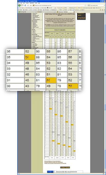 Here’s the US Army’s webpage explaining how many pushups one must accomplish to pass basic training. All the user wants to know is “how many pushups must I do to pass?”
As you can see (or not), there are 750 cells of data in the US Army’s chart, just to answer this simple question. Only 20 numbers here are actually helpful at all, and even less if you organize it properly.
This, as Rob put it, is as if “you asked someone on the street the time, and he proceeds to list off the time in every single time zone. That information may be useful to someone, but not to me and not right now.”
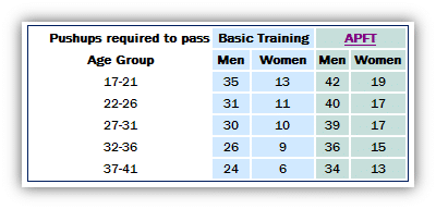
The entire hundred-line-long chart could have been consolidated into this:
How would call handle time be impacted if this giant chart had been a list of interest rates for a credit card application? A list of products and prices in a nationwide catalog? Can you think of other examples in your organization?
If all the information truly was required, you can consider progressive disclosure through a simple, optional link for more information.
tl;dr
Every user is engaged in your app for a specific purpose. They intend to get their task completed and move on as quickly as possible. Because users are in a hurry, we developers and designers must remember that users don’t read. They scan. But what is the difference? Let’s look, courtesy of Microsoft for publishing results of ongoing user interaction and eye-tracking research studies.
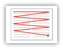 |
The goal of reading is comprehension and deep understanding.
|
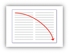 |
The goal of scanning is to locate things.
|
 |
If there is text along the left edge of a page, users typically scan it first.
|
As the research concludes, users read bits of text comprehensively only when they believe they need to (never!), and users will always skip over large blocks of text without reading them at all (looking for headlines).
Case Studies
Here’s a SharePoint website running in a a user’s full screen browser, running at 1024×768 (the default screen resolution for most monitors in the Windows XP era).
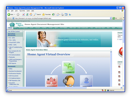
No content on the page is able to be scanned because nothing fits. The content off the page might as well be invisible — users will not scroll horizontally to find hidden content. The mouse does not enable horizontal scrolling, and it’s exceedingly difficult to target, grab, and scroll to the right: users will not work to make up for poor design.
Here’s a Calendar from the same website:
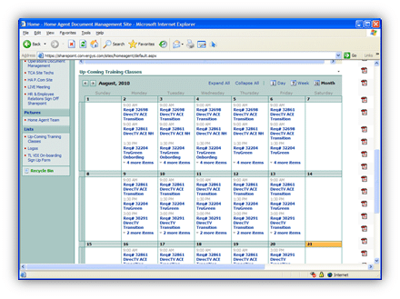
Because of recurring events, every single day on this calendar view is truncated. Sacrifice the monthly planner style for an event list, and your users will be more informed and more productive.
Inconsistent formatting is another designer faux pas. When text formatting differs by any means (any one or more of size, color, shape, spacing), the readability of the text is automatically cut in half. It’s not only distracting but it is hard to follow and scan (remember, users weren’t reading it in the first place).
Consider these side-by-side examples. Which would you rather try to read for clarity and immediate understanding?
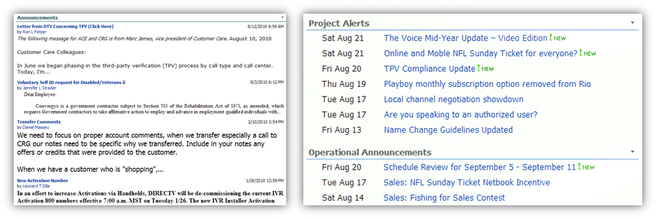
In addition to shorter “newspaper” style headings, the example on the right includes friendly date display so users know which item(s) they’ve already seen, as well as markers for new content. It is also grouped by relevance so the users can quickly scan in context.
Finally, let’s look at how not to navbar. This site’s navigation bar was cluttered with duplicates, bad grammar, vague descriptions, and true garbage, and was so lengthy that it required four full pages of scrolling just to reach the end. How is a user supposed to navigate this quickly?
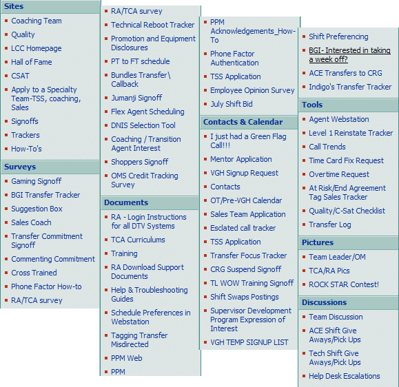
While you try to make sense of this, also look at the group headings? Is this where you’d go to find an item? The example from the right is after extensive cleanup. All the same functionality with none of the mess:
Closing
Taking steps to consolidate and simplify the user experience provides users with many tangible benefits, while boosting the performance of the team and company as a whole. Increasing user confidence by reducing concepts not only saves time and effort, but lowers training time considerably. All of these aspects have very real and direct impacts to our ability to function profitably and successfully.
For further reading, point your favorite web search engine to “user experience guidelines” or “user experience optimization”.
